Replace text in an image while keeping the new wording as close as possible to the original font style, color, spacing, and effects. When you need to edit text in an image while keeping the same font style, upload the image, enter the text you want to replace and the new wording, and check the result - no original font file required.
Can you edit text in image with same font?
Yes. Even if you only have a JPG or PNG and no longer have the original font, ChangeTextImage can match the visible font style and replace the text so it blends naturally with the image. It matches the appearance of the font rather than identifying or recovering the exact original typeface.
Use cases
beforeafter
Decorative serifORIGINAL FONT MISSING
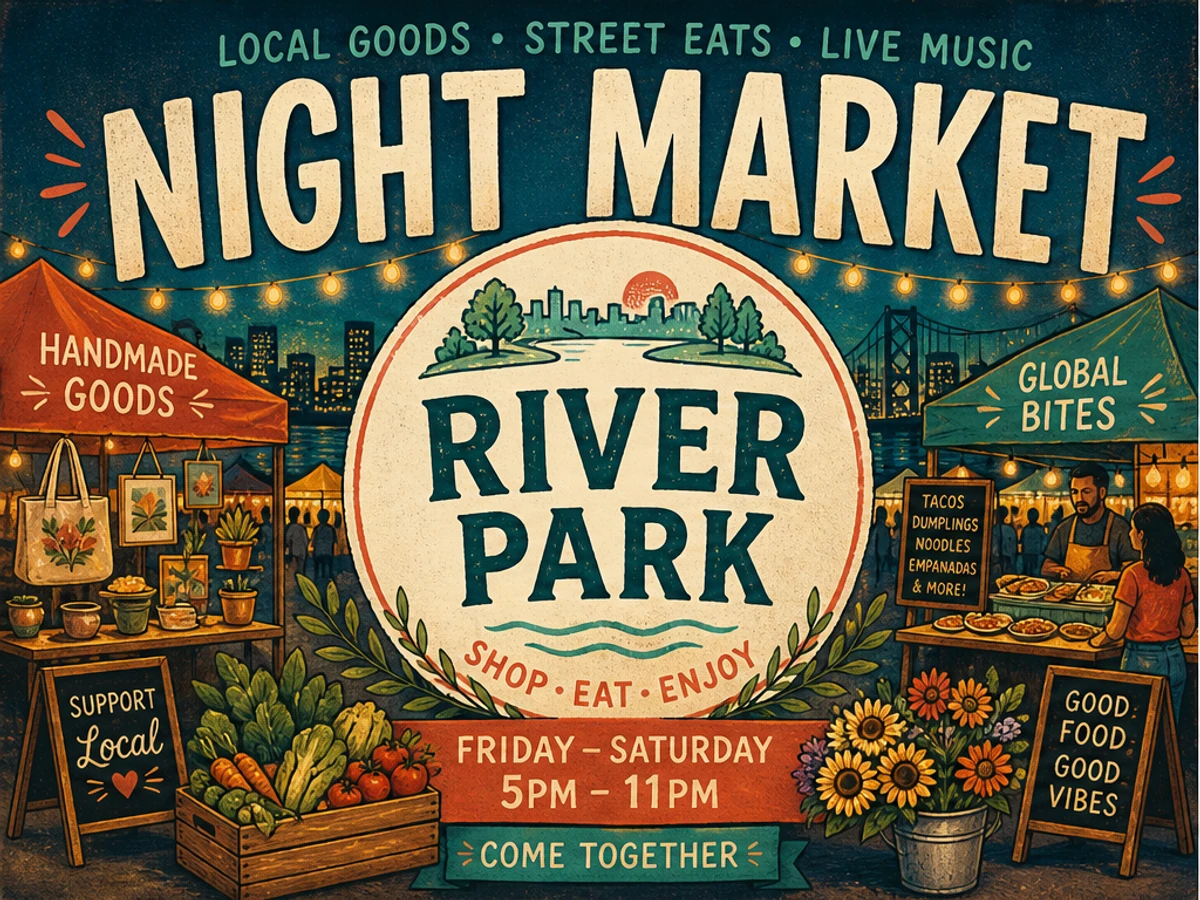
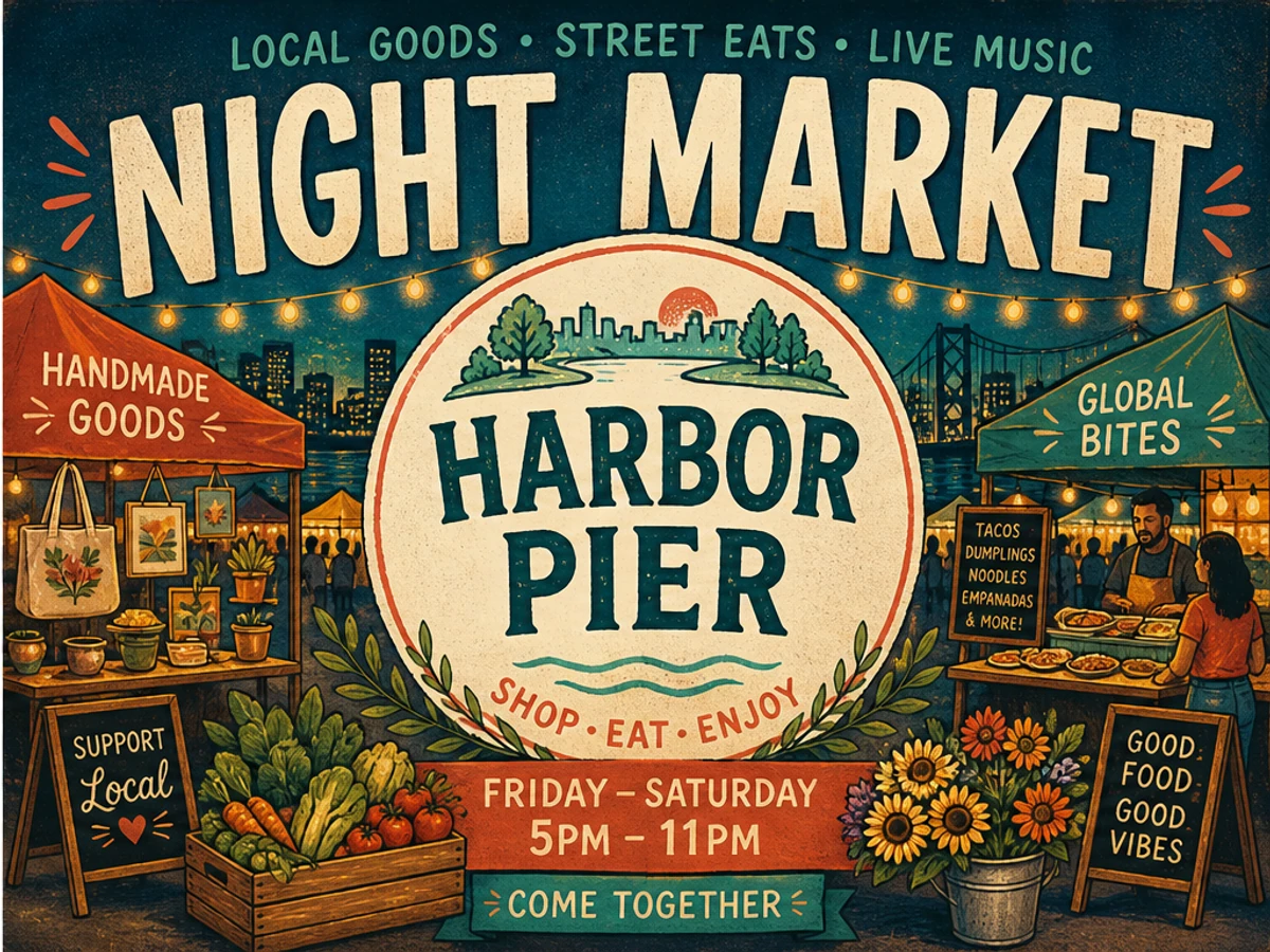
Update a market name while keeping the illustrated type treatment
The original title uses a bold decorative serif with a slightly distressed texture. The replacement keeps a similar weight, spacing, curve, and overall style so it still feels like part of the original poster.
beforeRIVER PARK->afterHARBOR PIER
beforeafter
Neon display typeVENUE MOVED
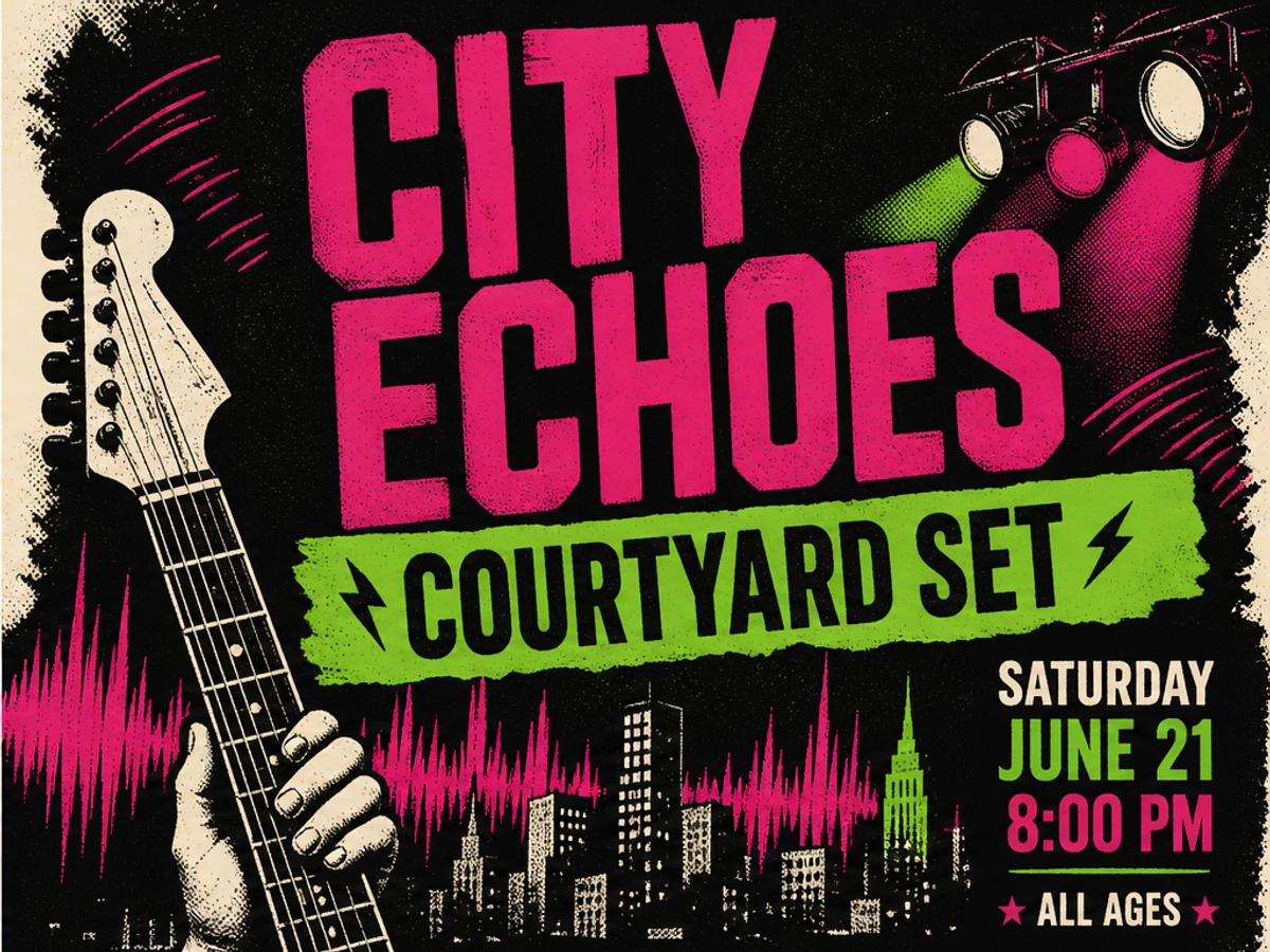
Update a venue line while keeping the concert poster style
The location line sits inside bold neon lettering, so the replacement needs to keep the same width, glow, spacing, and visual rhythm. The guitar, lights, halftone texture, and color treatment should still feel like one poster after the venue changes.
beforeROOFTOP SET->afterCOURTYARD SET
beforeafter
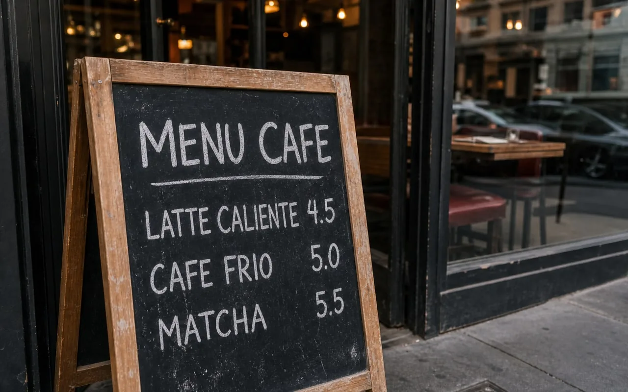
Handwritten signLONGER WORDING
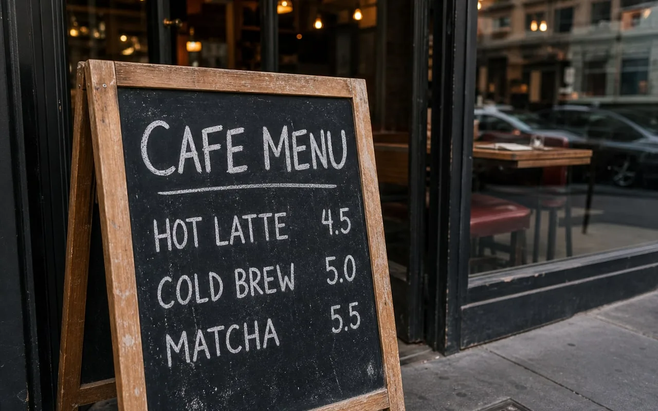
Replace chalk lettering while keeping the board texture
Handwritten lettering depends on stroke rhythm, spacing, chalk texture, and the way the words sit on the board. The longer phrase is a good reminder that a close style match can still need a new layout.
beforeHOT LATTE->afterLATTE CALIENTE
What does a visual font match preserve?
You do not need the original font file to make a new word feel at home in an existing image.
A good font-style match keeps the new wording close to the original in weight, color, spacing, alignment, shadows, texture, and angle. Upload the clearest image you have, enter the old and new wording, and check the replacement at full size.
The result aims to preserve the appearance of the original text, not tell you the font name or recreate every letter perfectly. A clear word gives the editor more to work with than a tiny, blurry, or heavily distorted one.
If you still have a PSD, Canva, Figma, or other editable design, use the real text layer first. Changing the image itself is most helpful when the source file is gone or the design was already saved as a finished picture.
Font Match Review Card
Look at the lettering as part of the whole image, not just as a word on its own.
Font style
Example change
What to check
Helpful reminder
Sans-serif
THIS SUNDAY -> NEXT SUNDAY
Weight, width, baseline, and alignment
Short uppercase lines are easier to compare when the image is clear.
Serif
START NOW -> GET 50% OFF
Serifs, contrast, spacing, and line fit
A longer offer can make the spacing look squeezed even when the color is right.
Script
A short connected word
Stroke rhythm, joins, and letter separation
Use a clean image and look closely when letters touch or overlap.
Decorative
RIVER PARK -> HARBOR PIER
Overall shape, texture, outline, and angle
Distinctive display lettering needs a full-size check, not just a similar font name.
How can the new wording fit the image?
Start with the overall shape of the words, then look at the details that make them feel connected to the image.
Compare width and stroke weight
Look at the height, width, thick and thin strokes, and overall density of the old and new words. A replacement can fit the same space and still look out of place.
Check baseline, spacing, and angle
Check the space between letters, the line height, curve, angle, and alignment with nearby objects. A word that sits slightly above the original line can make the whole graphic feel wrong.
Inspect color, effects, and texture
Compare fill color under the same light, plus outline, shadow, glow, distress, reflection, grain, and how the text meets the background. These details often matter as much as the letter shapes.
Return to publishing size
Zoom in to find broken edges, then view the image at the size where people will actually see it. Keep the original until you are happy with the change.
Tips for a closer font-style match
A clear image is more useful than knowing the name of a similar font.
Use the least-compressed export
Thin serifs, soft shadows, and chalk edges disappear quickly in messaging-app copies. Upload the original JPG, PNG, or WebP whenever possible.
Keep neighboring letters visible
Do not crop so tightly that the replacement loses clues from nearby letters, color, spacing, and texture across the whole line.
Keep replacement length realistic
A twelve-letter phrase cannot always fit naturally into the space designed for four letters. Shorten the wording or rebuild the layout when the message truly needs more room.
When should you use the original design instead?
Some images need the real source file, even when the replacement looks convincing on screen.
Brand production and print masters
Use the original fonts and editable design for logos, packaging, signage systems, and print-ready brand materials.
Large blocks of copy
Paragraphs need reliable line breaks, language support, and an easy way to update the words later. Rebuild them as real text.
Very small or hidden lettering
If the image does not show the letter edges clearly, a close match is much harder. Find a cleaner version or create a new text treatment manually.
Try a font-style match
Upload the clearest finished image, choose wording that fits the available space, and inspect the result at the size where it will be used.
Frequently asked questions.
Can I edit text in image with same font?
It means replacing visible words while trying to preserve their visible style: weight, width, color, spacing, effects, texture, and perspective. The goal is a close visual match, not recovering the exact original font file.
Does it work with handwritten text?
It can try to follow visible stroke rhythm, spacing, color, and texture, but connected script and irregular handwriting need especially careful checking. A clean, high-resolution image helps.
What if the replacement is much longer?
A longer phrase may need shorter wording, a new line, or a manual layout change. Do not accept compressed spacing simply because every character technically fits.
Can it preserve text shadows and outlines?
It tries to follow visible shadows, outlines, glow, grain, texture, lighting, and perspective. Compare the replacement with nearby letters at full size because an exact match is not guaranteed.
Which font styles are hardest to match?
Tiny, blurred, connected, highly decorative, curved, distressed, or partly hidden lettering is harder to match. Use the source file or manual typesetting when precision matters.
Is this the same as using a font finder?
No. A font finder suggests font names that look similar. This editor replaces the visible word in context, including the surrounding background and style.
What upload formats and size are supported?
Upload JPG, JPEG, PNG, and WebP files up to 10 MB. Use the clearest original export available rather than a compressed screenshot of a screenshot.
Is there a one-time preview for a new account?
Sign in to receive one lifetime 512px low-quality preview credit for the account. This is a one-time preview, not an unlimited free plan.
Does ChangeTextImage add a watermark?
ChangeTextImage does not add a site watermark to generated downloads.
What if the result does not look right?
Keep the original file, inspect the replacement at full size and normal publishing size, and decide whether a tighter target, a cleaner source, or a manual rebuild is the better next step.