What a Matcha filter changes—and what it keeps
Fotor’s public comparison is a useful reference because it holds the same café selfie in place. The filtered version retains the couple, the cup, the café awning, and the main light direction, while changing the photo into yellow-green squares with glossy contour lines. That is the distinction people usually mean by a Matcha filter: the scene remains recognisable, but its surface becomes the style.
Read a filtered result at two distances. First, step back: can you still identify the subject and the image’s mood without effort? Then inspect the area that carries meaning: a product, a sign, a face, or a line of text. The filter is serving the image when the first reading still works and no essential second-reading detail has become decoration.
If the small detail itself is the message, use the original photo instead.
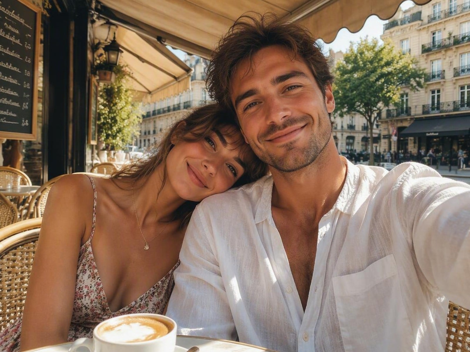
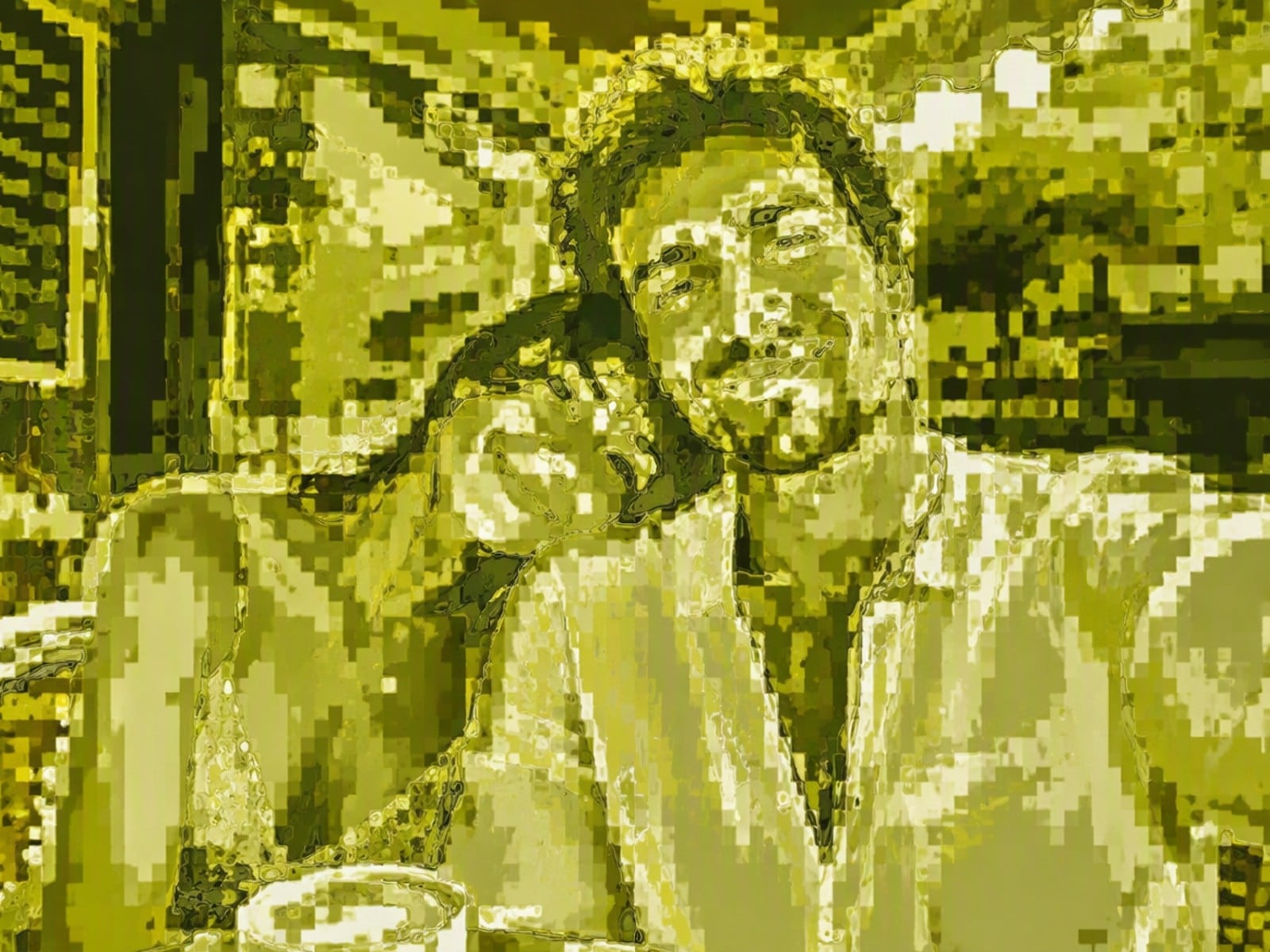
Fotor’s published comparison keeps the café selfie in the same composition while turning its color and fine texture into a yellow-green, blocky, glossy surface. View source
Portraits work when the face is readable before the color changes
A close portrait can work because a face, hand, hair silhouette, and a simple white top give the filter several large shapes to preserve. In Fotor’s reference, the person still reads immediately after the yellow-green treatment, even though the eyelashes, skin texture, bedding, and blind slats no longer behave like photographic detail.
That trade is useful when the image is there to set a mood or hold attention in a collage. It is not useful when a particular garment, precise facial detail, small accessory, or original photographic texture is the reason people should look closely. Choose the source image when those details are the story.

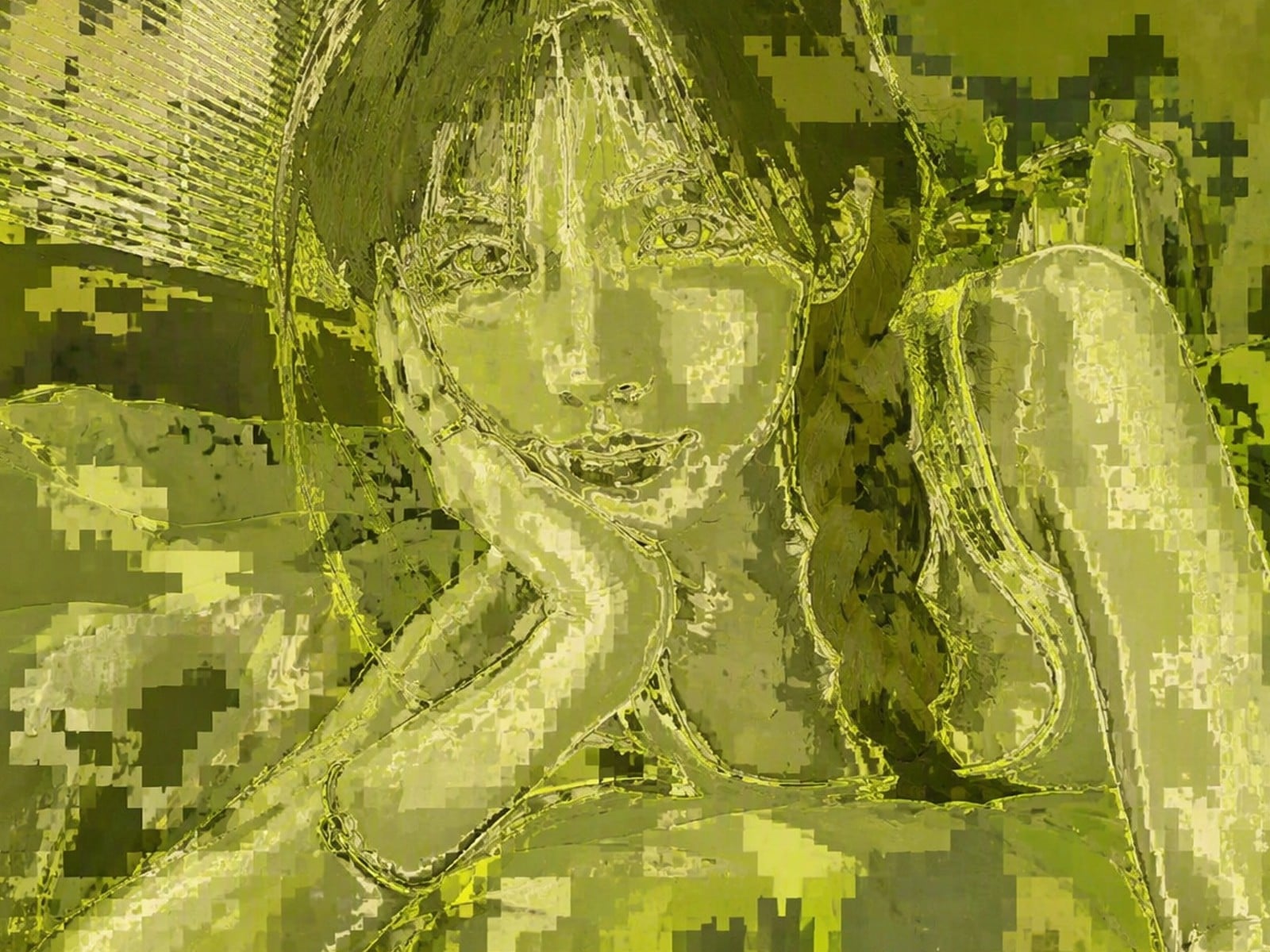
Fotor’s published close-portrait pair preserves the face, hand, pose, and white top while turning small detail into a yellow-green, blocky, glossy treatment. View source
Large, simple shapes hold together after the filter adds its texture
The car portrait gives the treatment a large face, a dark hoodie, a pair of headphones, and broad window shapes. Fotor’s after image still reads as the same person in the same car, but the mountain view, seat stitching, and headphone marks collapse into broad olive and lime blocks. It is a good reminder to start with an image whose main idea remains clear without its tiny details.
The same rule applies to food and lifestyle images. A drink, a hand, and a clear outfit can remain the visual idea; phone labels, packaging copy, menus, and other reading tasks should never be asked to survive a full filter treatment. If those details are central to the post, use the original photo or a source design for the message.

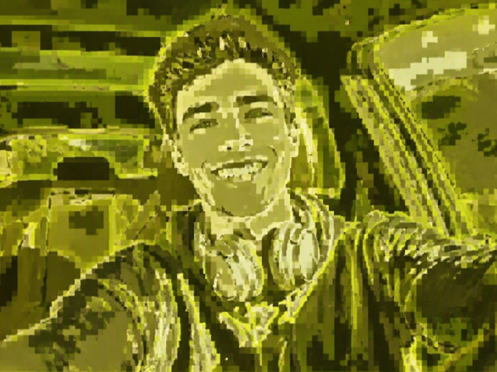
Fotor’s published car-portrait pair keeps the person, hoodie, headphones, and window shapes legible while replacing fine scenery and texture with yellow-green blocks. View source
Choose a clear scene, not a busy message
A scene with a visible subject and a modest amount of background detail makes it easier for viewers to read the filtered idea quickly. The Fotor examples still work because the face, pose, shirt, car, and café setting were obvious before the effect simplified them. A clear composition gives the color and texture room to do their job without becoming visual noise.
Treat that as an invitation to test compositions, not as a reason to put every graphic image through the effect. A mural, poster, product package, book cover, or shop sign may look visually striking after a green treatment while losing exactly the information that made the original useful. The composition may survive; the message may not.
Three reasons to skip the full cover
First, skip it when text is the message. A style treatment cannot carry information that has to be read precisely: menu choices, prices, a date, a product label, a screen state, a booking detail, or a promotion code all need an original or source design.
Second, skip it when authenticity depends on surface detail. A maker showing a textile, a close-up of food, a piece of artwork, or a product finish may need the weave, grain, print, or edge clarity that the filter deliberately transforms. Third, skip it when you need the image to document something exactly. A decorative rendering is the wrong format for that task.
If the original contains wording you need to change, edit the source design when it exists.
If you need to change wording in an authorized flattened image, use an image text editor instead of relying on a filter to turn important pixels into a background.
A 60-second comparison before you share it
The fastest reliable workflow is a side-by-side check, not a perfect prediction from the original. Use a duplicate of the photo, apply the current cover, and keep both versions open while you decide. You are looking for a deliberate change in mood, not a rescue for a weak crop or a message the viewer must read.
Name the one thing that must survive
Before you style anything, say what the viewer should notice first: the person, the drink, the silhouette, the light, or the location. If the honest answer is a sentence, price, name, label, or fine pattern, preserve the original for that use.
Apply the cover to a copy, then check the shape before the color
Do not judge by “matcha green” alone. Cover the output with your hand or zoom out mentally and ask whether the subject still reads from its outline and contrast. If the image becomes an undifferentiated field, a different source photo will help more than forcing a stronger treatment.
Inspect the meaningful detail at the final size
Look at the version as it will appear in a feed, story, article, or presentation—not only enlarged in an editor. Check any face, product, sign, interface, text, or edge that the viewer may need. If it is no longer clear, choose the original or a lighter visual route.
Keep both files and use the covered one for the right job
The original remains the useful reference; the covered version is one expressive alternative. Save both with a clear name so a future update does not accidentally replace an informational image with its decorative counterpart.
- The main subject still reads from its shape, contrast, and placement.
- No required word, number, product detail, or interface label has become texture.
- The image still works at the final crop and display size.
- The original is retained, and the covered version is used only as a style treatment.